
Have you opened an email and are hit with six different fonts that made it hard to figure out which message was most important? Has someone volunteered to design a flyer for an upcoming event and have you not known what to say when they asked you for identity guidelines? Chances are good that a set style guide is missing from both scenarios.
What is a style guide? A style guide is a document that outlines how your organization should look or be credited in print, web, or other media. Your organization’s style guide should include all the important guidelines for your organization’s voice and vision. “But, Laurice, why is a style guide important?” My top three reasons you need a style guide:
3 Reasons You Need a Style Guide
CONSISTENCY
Your brand style guide communicates your organization’s identity to everyone within your organization, vendors and freelancers, and is easily presented to partners who can use your style guide when using your “brand name” in materials and communication.
RECOGNIZABILITY
Creating (and adhering to) a style guide gives your audience consistency. When someone visits your website, sees your business card, or receives an email from you, they see the same “voice.” This makes your organizational brand recognizable.
TRUST BUILDING
You want your audience to trust you and your institution. Building a recognizable brand for your organization takes time but it is done more quickly when your audience knows what to expect because you stick to clear style guidelines and tone.
So what should be included in your style guide? And what’s the difference between a style guide and branding guidelines? Some companies have elaborate branding guidelines (Check out Spotify’s branding guidelines). Some are deeply detailed, like Love to Ride. You may not need a full set of branding guidelines. A minimalist, one page approach may be all you need to start out. I appreciate both. If I am working and just need a reference, I prefer to have a straight-forward, easy to read one-pager like Qapital’s. I am a huge fan of the specificity of Google Marketing Platform’s Visual Guidelines. This in depth look at the hows and the whens are great if I am new to a company or learning how to work with a new client. (It’s worth taking a look at both.)
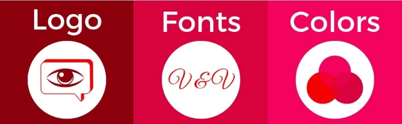
3 Style Guide Must Haves
Logo
Provide different variations of your logo. Include color, black and white, grayscale, or knocked out versions of your logo and provide guidance on when and how to use them. Do you have a logo that includes your tag or company slogan in smaller type? Be sure to provide a minimum size for use. If your logo is used with a tag in a small size people won’t be able to read the tag and then the rest of your organization’s brand is crowded.
It may also be helpful to provide examples of how NOT to use your logo. People can get pretty creative if left to their own devices.
We’ve all seen the I Heart NY logo. What you may not have considered is how specific the management of that logo is. Check it out. (Be sure to look at the “don’ts” on page 33.)
Typeface/Font
A lot of us take text for granted, but it can send a very specific message. Remember when Google changed its font a couple of years ago? The change in the lowercase “a” still makes me unreasonable happy. (I’m a big fan of Google if you couldn’t tell. Read more about their design story.)
Make sure that the typeface you choose for your brand is legible (and accessible). Sure, it’s ok to have a beautiful script for a heading but you wouldn’t want your footer to be in that font.
MTA, responsible for millions of New Yorkers’ transportation every day, has very clear guidelines around typeface. How many people stop to think about the perfection of the lowercase “o” when they see a subway exit sign pointing to “Broadway?”
Color Palette
Colors are often very important to an organization’s voice. If you have gone through an intensive branding exercise, then by all means use it!
Create an Adobe Creative Cloud color group that you can give to designers or for use in house. If you use a tool like Canva you can set up your brand kit, which can include multiple palettes.
Think of the importance of color to your organization or others you know. Do you know what color the Coca-Cola logo is? Without thinking about you probably answered “red.” How about Google? (Sorry, they’re just THAT good!) The vibrant four color palette is recognizable and bold, but still clean.
Do you have a secondary palette that you use for special events? Is it ok to use variant tones of the primary palette? If you want to save time looking at designs that have nothing to do with your organization’s unique brand, now’s the time to put that guidance in print for everyone to see it.
Look, I can’t tell you what to do, but if I COULD I’d tell you to invest a few dollars or a couple of hours to clarify your organization’s voice. It will make your life easier down the road and your audiences will thank you for helping them recognize and understand your work more easily.
Need someone to design your logo, re-brand your organization, or build a style guide for the company you’re currently running? We can help! Find out how in our services menu.
