I will be the first to tell you that three years ago (despite being blind in one eye myself), the last thing I was thinking about was accessible design. In fact, this was not something that had ever been discussed in any of the spaces I had been in. All I knew about accessible technology was a friend who is vision impaired uses a screen reader, whatever that was.
Today, after working for the last two and a half years with the Cultural Access Network, I am always thinking about accessibility, particularly in the places I wield some power. As someone with a vision impairment, I am now particularly aware of accessible design in the emails I receive and on the websites I visit.
You may be thinking, “but I am fully sighted (with corrective lenses). Why should I care?” Glad you asked! The World Health Organization (WHO), estimates that 1.3 billion people live with some form of visual impairment. Of those, 217 million living with moderate to severe vision impairment and 36 million people worldwide are blind.
So when we are talking about being welcoming and inclusionary in our work places, in our spiritual spaces, and in our marketing, we are doing a huge disservice to a large number of folks if we send out an email that is all graphics. So let’s talk about alt text. (We’ll talk about color contrast, font size, and all that another time.)
What is alt text? Alt text (alternative text), also known as “alt attributes”, “alt descriptions”, or technically incorrectly as “alt tags,” describes the appearance and function of an image on a page. This text helps screen-reading tools describe images to visually impaired readers.
If empathy isn’t your strong suit or you don’t care about losing your vision impaired audience, here’s another reason to add alt text to images. Alt text enables search engines to better crawl and rank your website. This is going to improve your search engine results. So if you are focused on SEO (search engine optimization) and neglecting alt text, you are missing out! Because more and more people are using Google to search for images and if you don’t have alt text on the beautiful images on your blog, no one is ever going to find them.
Just throwing in some random tags and phrases isn’t going to do it. This HubSpot article has some great “good vs. bad” alt text samples. Be thoughtful about your alt text because Google is now scoring your website on accessibility. The Google Lighthouse accessibility score is based on how sites perform in a variety of tests. You can learn more about it here. So if you have similar content on your site as your competitor but they have an accessible web design, guess which one your audience is going to see first in their search results?

It’s not hard. It just takes awareness and a little time. Here are three easy ways to up your accessible marketing game.
- You don’t need to say “picture of.” We already know that it is an image so go ahead and jump right into your description.
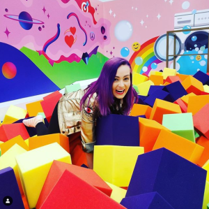
- Be very descriptive. The better an image you can paint with words, the more effective your alt text will be. I highly recommend following my friend Molly Burke on Instagram. Molly is a Canadian YouTuber and motivational speaker who began to lose her sight at the age of four. Molly takes her accessibility descriptions to a new level for her Instagram fans. Example: “Photo Description: Molly is looking up and laughing at the camera. She is so happy as she is in the middle of colorful foam blocks that are in a very fun foam pit in the Instagram lounge”

- That being said, keep it brief. Most screen readers stop reading after 125 characters.
See, that isn’t so hard! So do your vision impaired followers a favor and start with the most basic of accessible design by using alt text today.

